VSCode Debug Visualizer는 편집기에서 데이터 구조를 시각화 할 수 있는 VSCode 확장입니다. 이는 디버깅 중에 감시 된 값을 시각화 하는 데 유용 할 수 있습니다. 확장 기능이 플롯, 테이블, 배열, 히스토그램 및 트리를 시각화 하는 데 도움이 될 수 있음을 발견했습니다.
https://addyosmani.com/assets/images/vsdraw-video.mp4
확장이 설치되면 관련 스크립트를 열고 명령 팔레트로 이동하여 Debug Visualizer : New View로 이동합니다. 이 보기를 사용하면 코드를 단계별로 실행하는 동안 시각화 되는 식을 입력 할 수 있습니다. VS Code의 워치 뷰와 매우 유사하지만 핵심적인 차이점은 결과가 텍스트 형식으로 표시되지 않고 시각화 된다는 점입니다.
시각화 할 텍스트를 선택한 경우 Debug Visualizer : Use Selection as Expression은 마지막으로 연 디버그 시각화 도우미 창에서 선택한 현재 텍스트를 평가할 수 있습니다.
공식 사례
VSCode Debug Visualizer의 JavaScript 예제는 기본 리포지토리에 포함되어 있습니다. 시작하려면 얀과 노드가 설치되어 있는지 확인한 후 다음을 수행하십시오.
소스 어딘가에 중단 점 / 디버거 문을 추가합니다 (예 : 50 행).
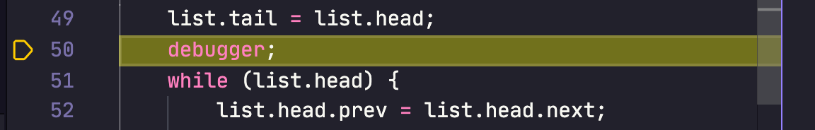
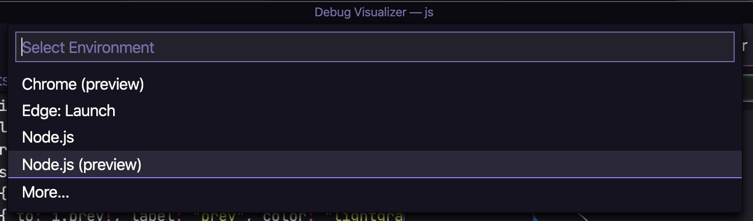
실행> 디버깅 시작으로 이동하고 환경 (예 : Node.js (미리보기))을 선택합니다.
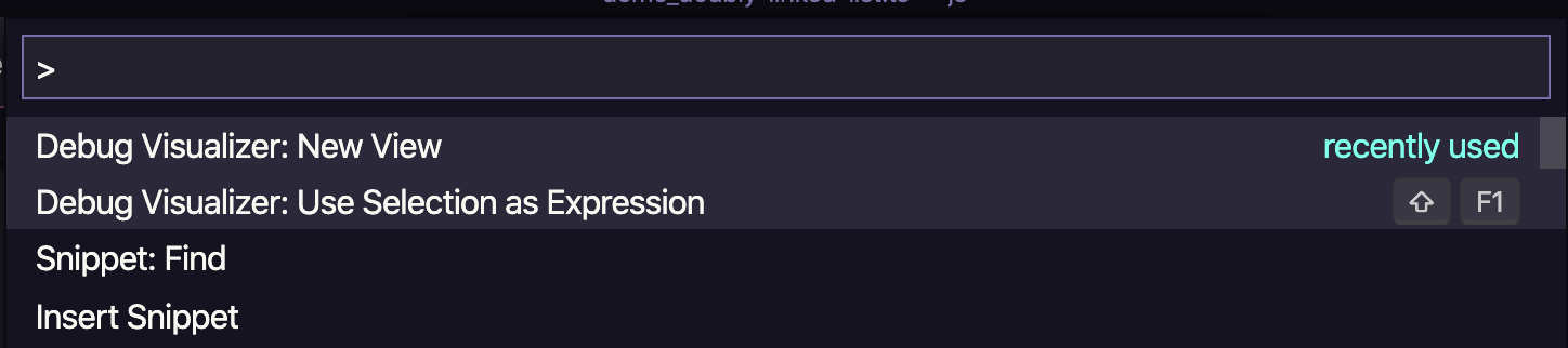
명령 팔레트에서 Debug Visualizer : New View를 선택합니다.
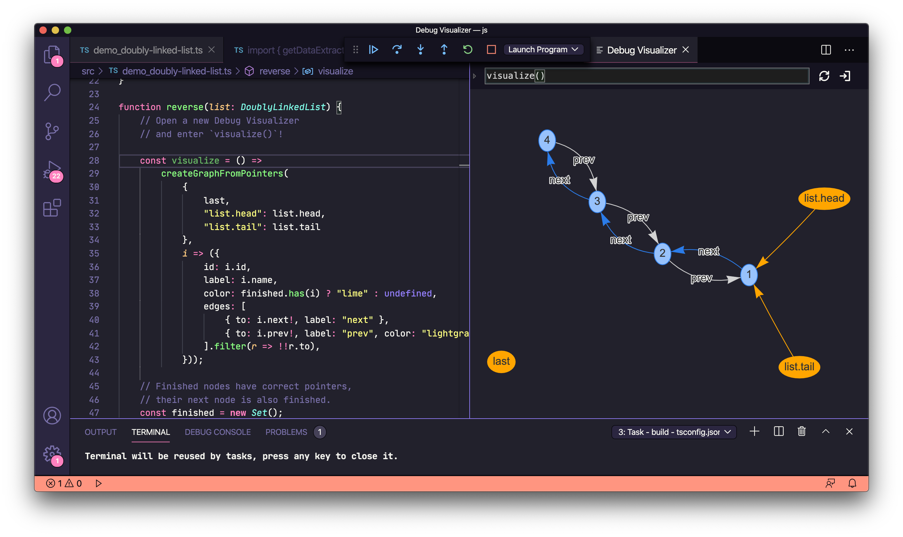
이제 프롬프트에 visualize()를 입력하고 편집기에서 이중 연결 목록에 대한 플롯 시각화를 볼 수 있습니다.
자신의 예를 들어보십시오
자체 예제에서 확장을 시도하기 전에 시각화 하려는식 이 JSON 개체 문자열로 평가되고 확장에서 지원되는 시각화 도우미 중 하나의 스키마와 일치해야 합니다 (배열과 같은 간단한 데이터 유형 제외). 아래 예에서 이 스키마의 일부인 "kind": { "graph": true}, "kind": { "plotly": true} 등 항목을 확인하십시오.
아래에서 확장 프로그램을 테스트 할 때 사용한 코드 스니펫을 찾을 수 있습니다.
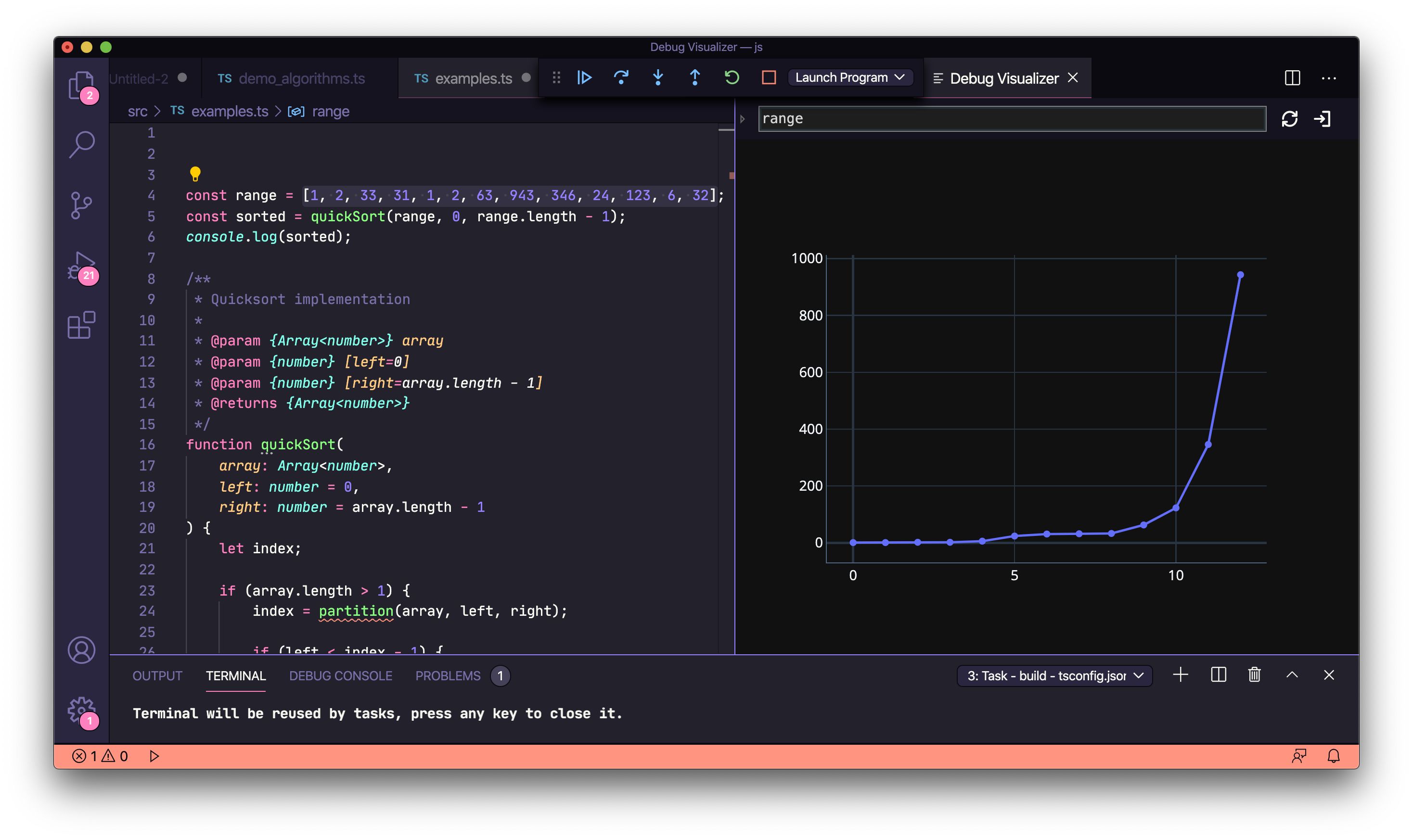
Arrays
const range = [1, 2, 33, 31, 1, 2, 63, 943, 346, 24, 123, 6, 32];
REST API의 동적 데이터
시각화 된 데이터는 정적 일 필요가 없습니다. 아래 fetch () 예제에서 설명 했듯이 REST API에서도 가져올 수 있습니다.
https://addyosmani.com/assets/images/vsdraw-rest.mp4
const fetch = require('node-fetch'); fetch('https://jsonplaceholder.typicode.com/users') .then((response) => response.json()) .then((json) => { debugger; });
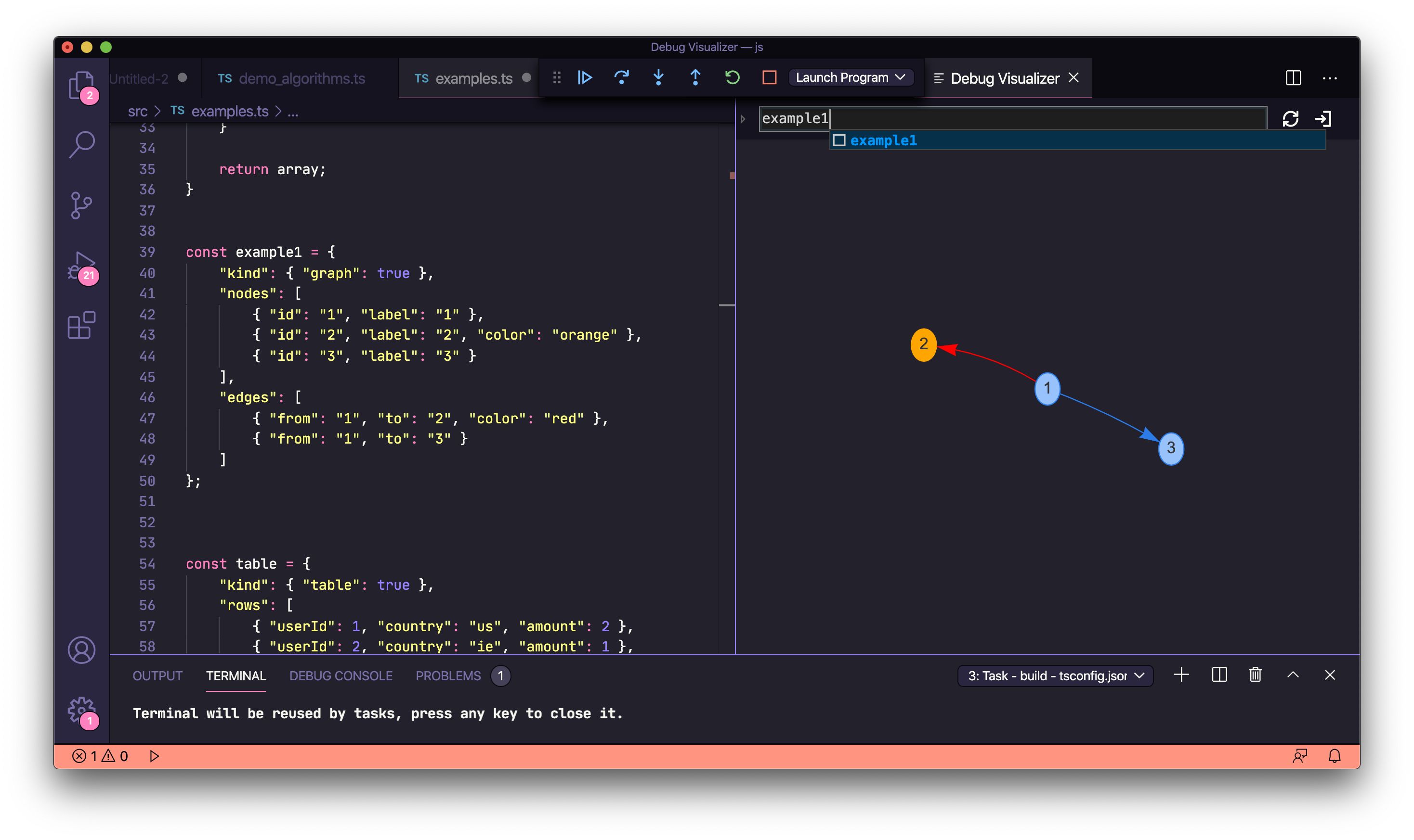
Graphs
const example1 = { "kind": { "graph": true }, "nodes": [ { "id": "1", "label": "1" }, { "id": "2", "label": "2", "color": "orange" }, { "id": "3", "label": "3" } ], "edges": [ { "from": "1", "to": "2", "color": "red" }, { "from": "1", "to": "3" } ] };
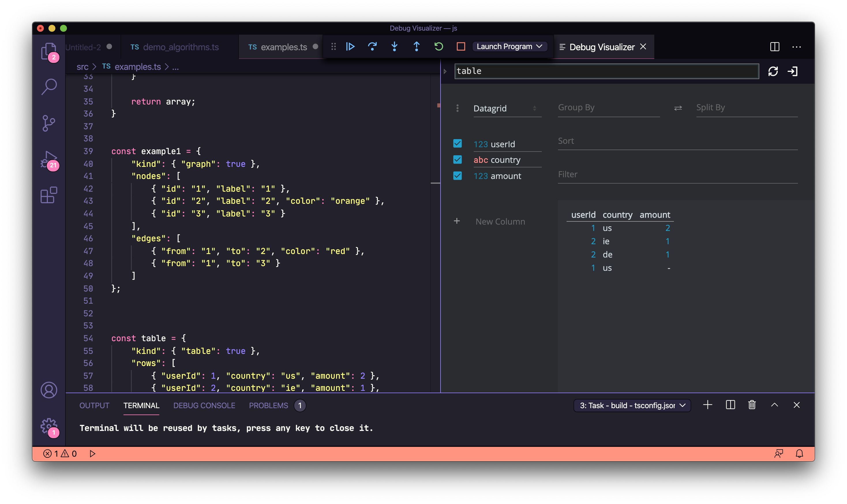
Tables
const table = { "kind": { "table": true }, "rows": [ { "userId": 1, "country": "us", "amount": 2 }, { "userId": 2, "country": "ie", "amount": 1 }, { "userId": 2, "country": "de", "amount": 1 }, { "userId": 1, "country": "us" } ] };
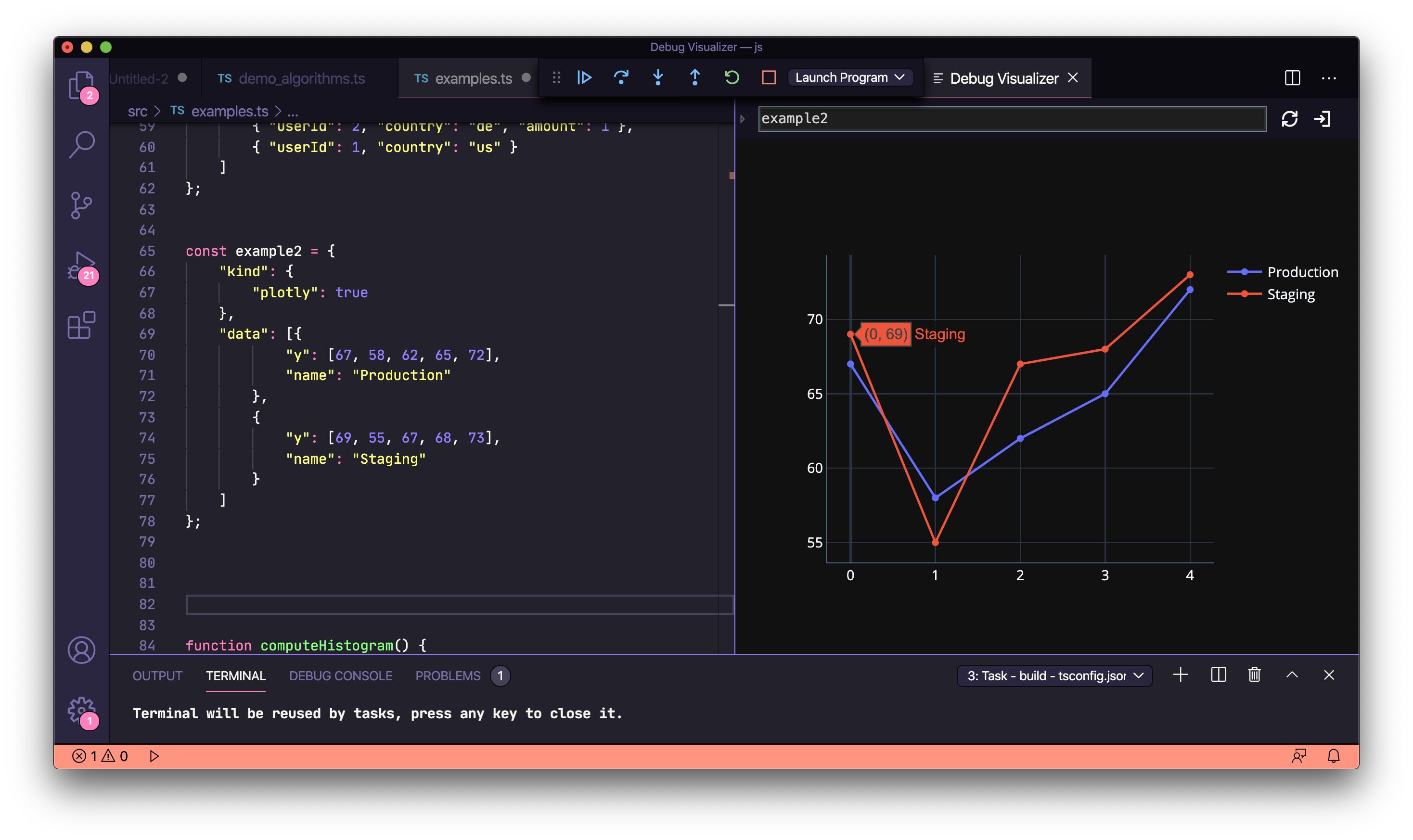
플롯 그래프
"kind": { "plotly": true}를 사용하면 시각화를 위해 Plotly 그래프 및 데이터 과학 라이브러리를 활용할 수 있습니다.
const example2 = { "kind": { "plotly": true }, "data": [{ "y": [67, 58, 62, 65, 72], "name": "Production" }, { "y": [69, 55, 67, 68, 73], "name": "Staging" } ] };
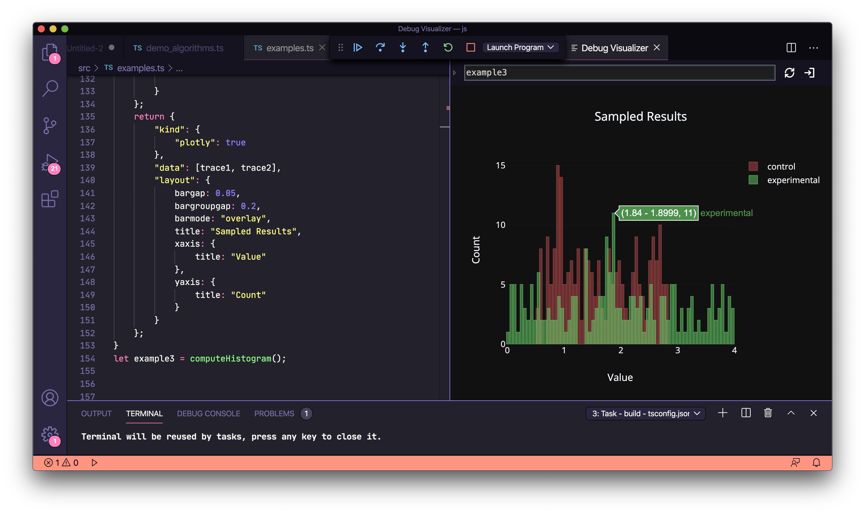
Plotly histograms
function computeHistogram() { const x1 = []; const x2 = []; const y1 = []; const y2 = []; let k = 0; for (let i = 1; i < 500; i++) { k = Math.random(); x1.push(k * 5); x2.push(k * 10); y1.push(k); y2.push(k * 2); } const trace1 = { x: x1, y: y1, name: 'control', autobinx: false, histnorm: "count", marker: { color: "rgba(255, 100, 102, 0.7)", line: { color: "rgba(255, 100, 102, 1)", width: 1 } }, opacity: 0.5, type: "histogram", xbins: { end: 2.8, size: 0.06, start: .5 } }; const trace2 = { x: x2, y: y2, autobinx: false, marker: { color: "rgba(100, 200, 102, 0.7)", line: { color: "rgba(100, 200, 102, 1)", width: 1 } }, name: "experimental", opacity: 0.75, type: "histogram", xbins: { end: 4, size: 0.06, start: -3.2 } }; return { "kind": { "plotly": true }, "data": [trace1, trace2], "layout": { bargap: 0.05, bargroupgap: 0.2, barmode: "overlay", title: "Sampled Results", xaxis: { title: "Value" }, yaxis: { title: "Count" } } }; } let example3 = computeHistogram();
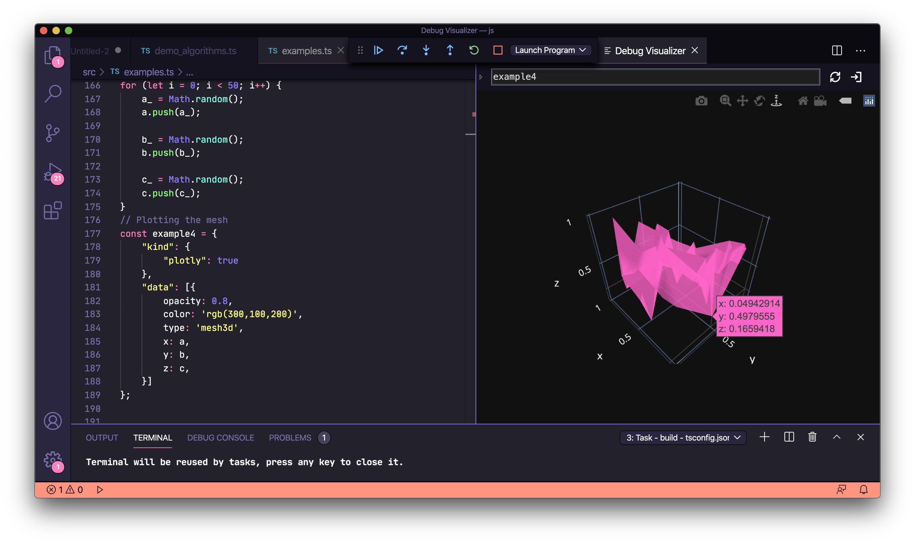
플롯 된 3D 메시 그래프
// Generate random data let a = []; let b = []; let c = []; let a_ = 0; let b_ = 0; let c_ = 0; for (let i = 0; i < 50; i++) { a_ = Math.random(); a.push(a_); b_ = Math.random(); b.push(b_); c_ = Math.random(); c.push(c_); } // Plot the mesh const example4 = { "kind": { "plotly": true }, "data": [{ opacity: 0.8, color: 'rgb(300,100,200)', type: 'mesh3d', x: a, y: b, z: c, }] };
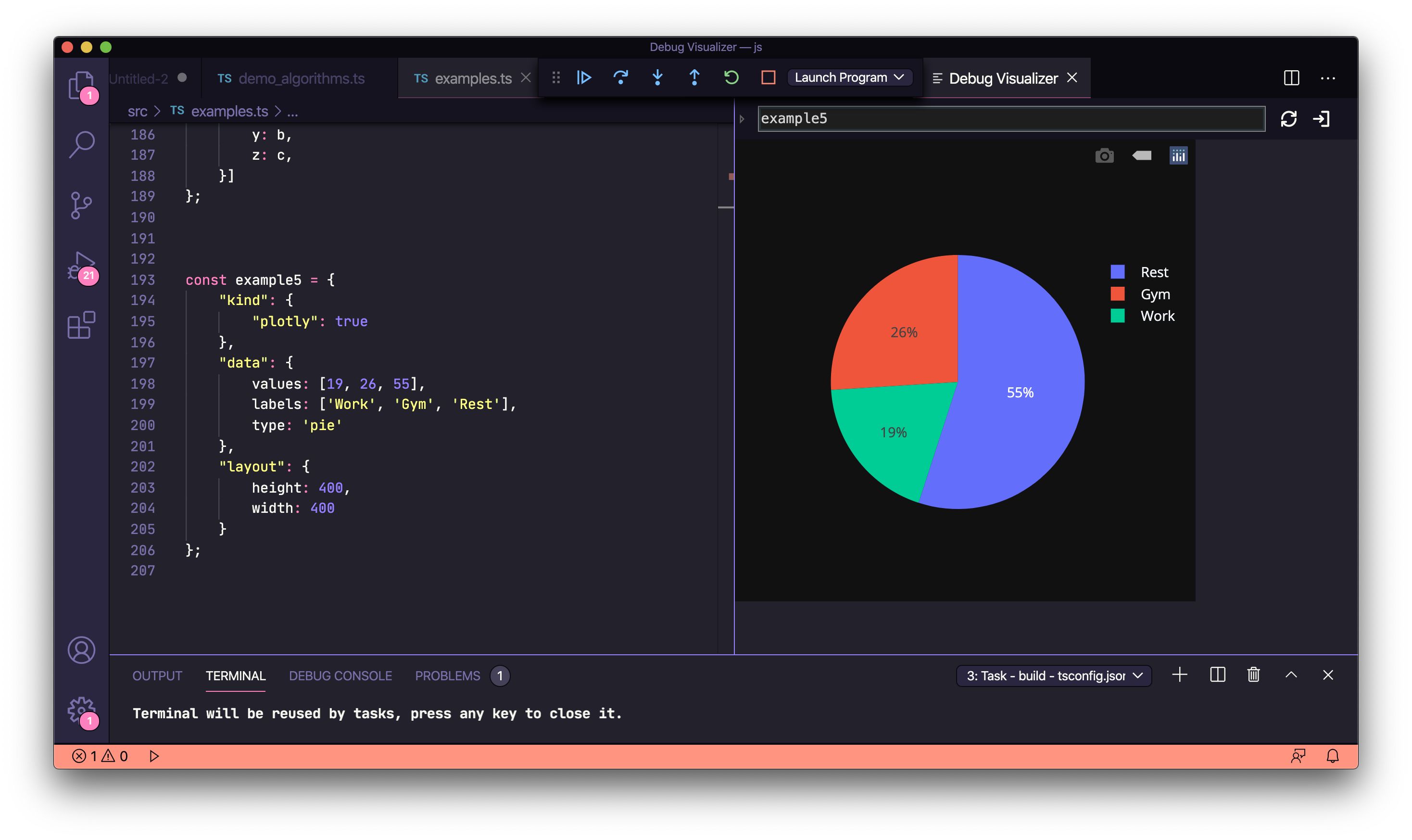
Plotly pie-charts
const example5 = { "kind": { "plotly": true }, "data": { values: [19, 26, 55], labels: ['Work', 'Gym', 'Rest'], type: 'pie' }, "layout": { height: 400, width: 400 } };
확장 프로그램을 만든 Henning Dieterichs에게 감사드립니다. 이것이 도움이 되었다면 그가 작성한 draw.io VSCode 확장을 사용해 보는 것도 좋습니다.
관련된 링크들
등록된 댓글이 없습니다.