CSS Grid 및 Flexbox에서 상자 정렬이 어떻게 작동하는지 배울 준비가 되셨습니까? 이 기사는 당신을 위한 것입니다.
https://ishadeed.com/article/learn-box-alignment/
소개
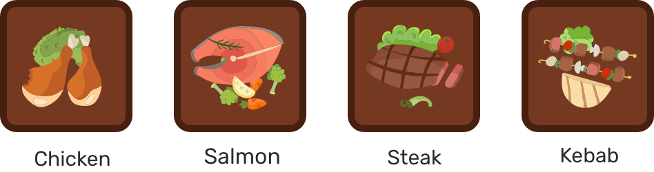
테이블과 4 개의 접시가 있습니다. 이 기사 전체에서 Flexbox 및 Grid를 사용하여 고객을 위해 플레이트를 다르게 정렬하는 방법을 배웁니다.
플레이트 크기
시작하기 위해 플레이트의 너비(width)와 높이(height)를 추가했습니다.
<div class="c-table">
   <div class="c-plate salmon"></div>
   <div class="c-plate chicken"></div>
   <div class="c-plate steak"></div>
   <div class="c-plate kebab"></div>
</div>
.c-plate {
width: 96px;
height: 96px;
}판은 블록 요소이므로 각 판은 자체 라인에 있습니다.
Flexbox
시작하려면 display : flex를 .table 요소에 추가해야 합니다.
.c-table {
  display: flex;
}
플레이트는 서로 옆에 있습니다. flexbox는 단일 레이아웃 방향이므로 flex 항목은 행 또는 열로 정렬됩니다. 디폴트는 행입니다.
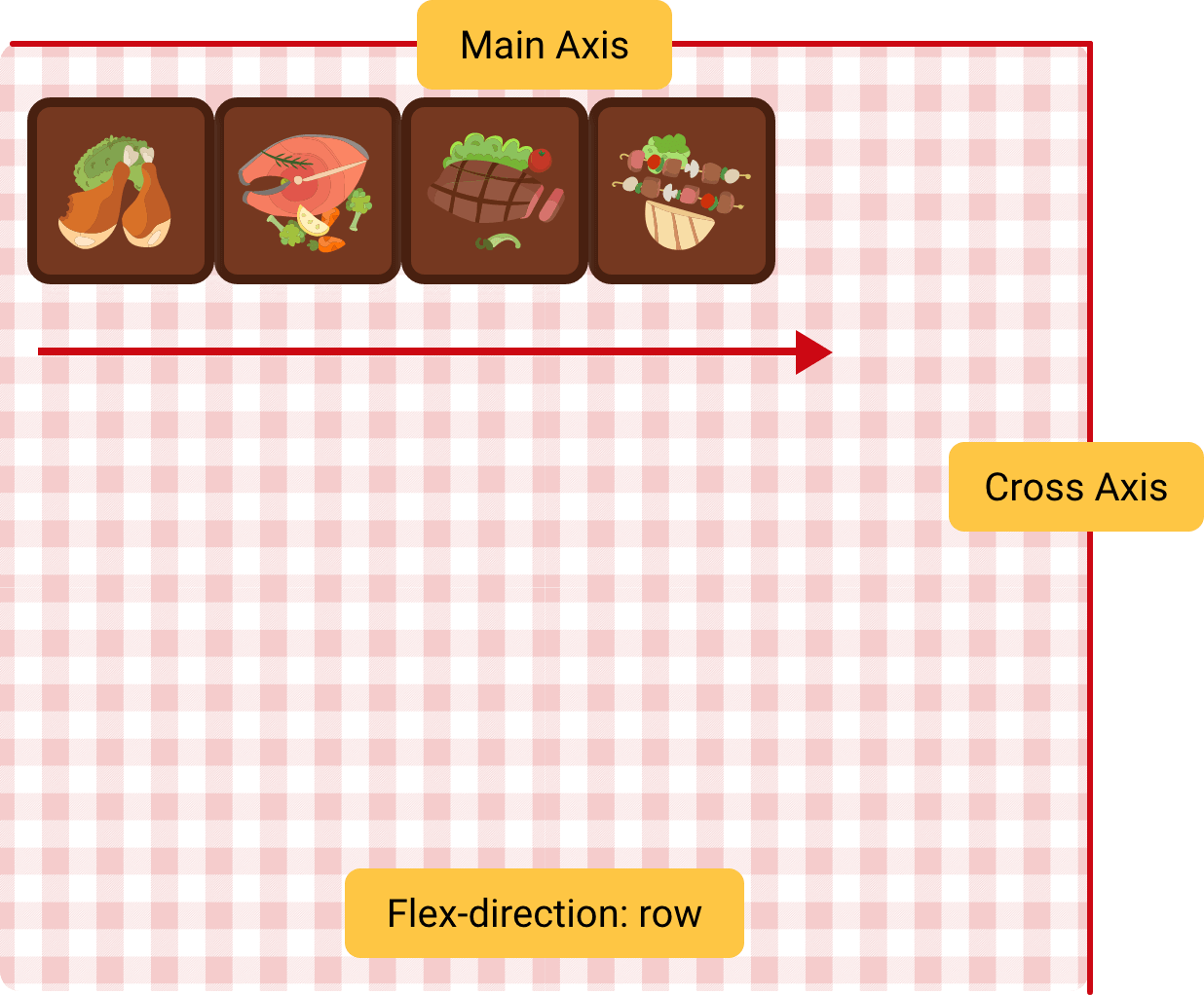
Flexbox Axes
flexbox에는 주축과 십자 축의 두 축이 있습니다. 다음 그림을 참조하십시오. 기본적으로 각 축의 위치는 그림과 같습니다.
.c-table {
  display: flex;
  /* Default flex-direction */
  flex-direction: row;
}
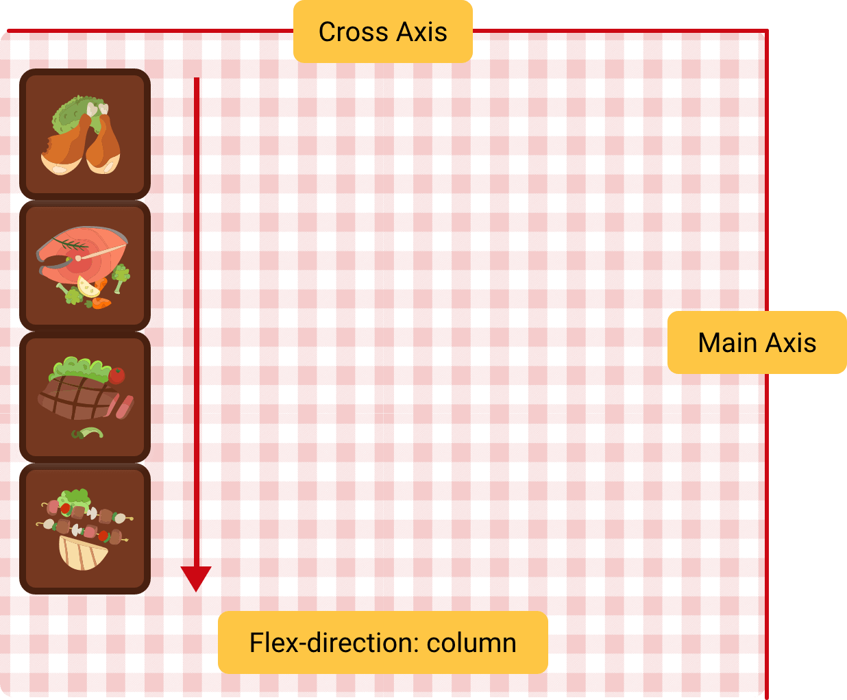
플렉스 방향이 flex-direction : column인 경우 플레이트가 세로로 표시됩니다.
.c-table {
  display: flex;
  flex-direction: column;
}
손님은 더 큰 접시를 요청했기 때문에 너비를 늘려야 합니다. 다음 CSS를 추가했습니다.
.c-plate {
  width: 50%;
  height: 96px;
}
예상되는 동작은 각 플레이트의 너비가 테이블의 50 %입니다. 맞습니까? 왜 작동하지 않습니까?
그 이유는 행에 사용 가능한 공간이 없을 때 flexbox가 플레이트를 새로운 라인으로 옮기지 않기 때문입니다. 이 문제를 해결하려면 flex-wrap : wrap을 사용해야 합니다. 공간이 충분하지 않은 경우 플레이트를 올바르게 감싸는 데 도움이 됩니다.
.c-table {
  display: flex;
  flex-wrap: wrap;
}
왜 각 판 사이에 공간이 있는지 궁금할 것입니다. 좋은 질문입니다.
기본적으로 테이블의 기본값은 align-items : stretch이므로 플렉스 항목은 교차 축에서 늘어납니다.
우리의 경우 판의 높이는 고정되어 있습니다. 그것을 제거하고 결과가 어떻게 보일지 봅시다.
.c-plate {
  width: 50%;
  height: initial;
}
Flexbox-내용 정렬
보시다시피, 플레이트가 올바르게 가운데에 있지 않습니다. 그것들을 정렬하려면, 횡축에서 플렉스 아이템을 제어해야 합니다. 이를 위해 align-content이 완벽합니다.
이 속성은 단일 행 플렉스 항목에서 작동하지 않습니다. flex-wrap:wrap이 필요합니다 : 랩이 제대로 작동하려면.
가로 축의 판을 가운데에 맞추기 위해 align-content : space-evenly를 추가했으며 결과는 다음 그림과 같습니다.
.c-table {
  display: flex;
  flex-wrap: wrap;
  align-content: space-evenly;
}

.c-plate {
  width: 50%;
  height: 90px;
}
normal, flex-start, flex-end, center, stretch, space-around, space-between, space-evenly, baseline, first-baseline, last-baseline
Flexbox - Justify Content
justify-content는 플렉스 컨테이너의 기본 축에서 작동합니다.
.c-table {
  display: flex;
  flex-wrap: wrap;
}

.c-plate {
  width: 90px;
  height: 90px;
}
주축을 가로 지르는 플레이트 사이의 간격을 동일하게 유지하기 위해 justify-content : space-between를 추가했습니다. 다음 그림의 결과를 참조하십시오.
.c-table {
  display: flex;
  flex-wrap: wrap;
  justify-content: space-between;
}

.c-plate {
  width: 90px;
  height: 90px;
}
normal, flex-start, flex-end, center, stretch, space-around, space-between, space-evenly, baseline, first-baseline, last-baseline
Flexbox - Align Items/Self
Align Items
기본적으로 align-items은 cross axis에서 작동합니다. 나는 align-items : center를 추가하여 판을 수직으로 중심에 둔다.
.c-table {
  display: flex;
  flex-wrap: wrap;
  justify-content: space-between;
  align-items: center;
}

.c-plate {
  width: 90px;
  height: 90px;
}
auto, normal, start, end, center, stretch, baseline, first baseline, last baseline
Align Self
게스트의 맞춤 정렬 요청이 있다고 가정합니다. 첫 번째와 마지막 플레이트는 다르게 정렬해야 합니다. 이를 위해 우리는 그러한 flex items에 align-self를 사용할 수 있습니다.
.salmon {
  align-self: flex-start;
}

.kebab {
  align-self: flex-end;
}
auto, normal, start, end, center, stretch, baseline, first baseline, last baseline
등록된 댓글이 없습니다.